Auckland Transport recently released their Transport Emissions Reduction Plan, also known by the terrible acronym “TERP”.
The full document includes the graph below, showing public transport usage per capita over the last hundred years or so.
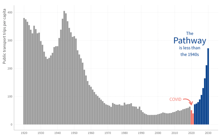
I quite like this graph, because it simultaneously shows the enormity of the change that will be coming in the next few years, while also showing it’s nothing we haven’t done before.
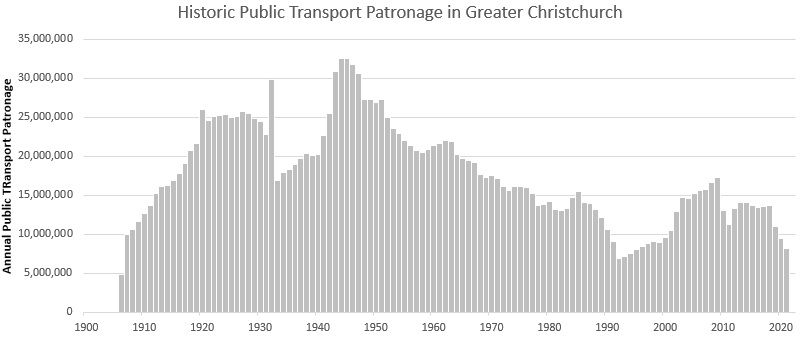
I wanted to recreate this for Christchurch. I managed to find some old records, sourced from Christchurch Transport Board reports. The raw data shows this.
This in itself is quite interesting. I’ve added a few annotations for key historic moments that I think are relevant.
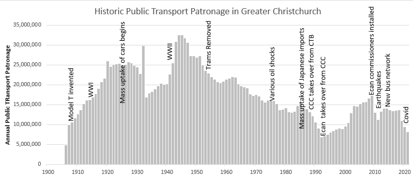
There are many more you could add to this.
One thing to note is that this graph only includes people using buses and trams, not the longer distance commuter trains. Trains carried far fewer people though: approximate patronage between 1946 and 1972 is shown below (sourced from a grainy photo of an unknown old book that a friend sent me).

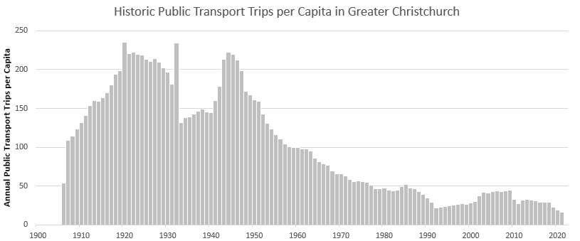
I’ve also converted the original data to a per capita basis below. This gets a bit muddly as it’s not always obvious whether to use the population of Christchurch City, Greater Christchurch, or somewhere in between. But roughly it looks like this. It’s basically the same shape, just an even more pronounced decline.
Note though that my vertical scale is different to Auckland’s – we have tended to have lower public transport use overall than them.
And here it is again showing the median value, and the rough level we expect to get to if we decide to honour our greenhouse gas reduction promises.
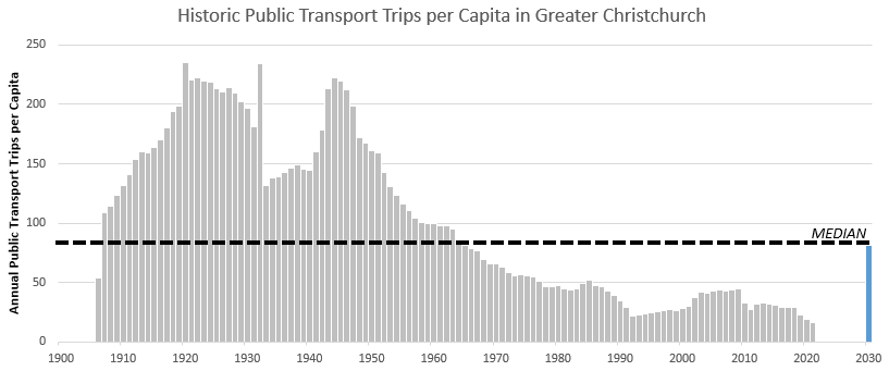
I think this is quite a useful visual. Similarly to Auckland, it shows that the upcoming level of public transport use is unprecedented in living memory, yet is still below the level that Christchurch has operated at for most of its history.
Any thoughts?
