I always enjoy seeing Greater Auckland publish monthly patronage data up there. I’ve shamelessly copied their format (“Imitation is the sincerest form of flattery that mediocrity can pay to greatness” and all that), and present to you the monthly public transport patronage data for Greater Christchurch.
I’m keen to do this regularly, but it probably won’t be monthly as ECan publish patronage data rather sporadically. It only gets published when the Greater Christchurch Public Transport Joint Committee meet up, which is not very often (it is supposed to be 4 times a year, but lots of the meetings seem to get cancelled). Their first meeting of 2019 was scheduled to be last week, so I was hoping to get the most recent data then. But this meeting was cancelled so there is still no 2019 patronage data. I’ve decided to just go ahead with this article anyway, which includes data up till October 2018, and hopefully at some point I’ll get some more recent data to report on.
First up, is a graph showing total monthly public transport boardings. Where possible, this has been split into the “frequent” network, the “connector” network, the “feeder” network and the “school” network. Note that the split numbers only began being reported in recent years, and even then the reporting is sporadic. This is different to the Auckland one which they split into ferry, bus, and train/BRT. Obviously that wouldn’t be relevant for us as we don’t have train/BRT and our ferry carries only small numbers.
I’ve created one graph showing the raw data, and one smoothed graph showing the 12 month rolling average.

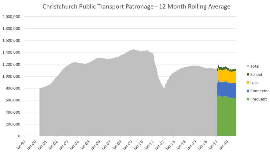
The shape of our public transport graph is very different to Auckland, and probably very different to any other city in the world, due to the earthquakes. Throughout the 2000s you can see patronage increasing quite healthily, before dropping off suddenly in 2011. It recovered somewhat over the next few years, but since the new network was implemented in 2014 it’s basically been very gradually declining. The last few months have been higher, so it may be that we’ve turned a corner. Or it may just be a blip.
Next, I’ve compared the October 2018 patronage (the latest data I have) to October 2017.
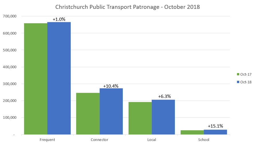
It shows increases across all service types. School and Connector services have increased more than the others – I have no idea why that would be.
One disclaimer is that, as Axel has written about previously, these graphs just show total boardings in the city, it is not per capita. So you need to keep population increase in your mind when looking at these.
I’m hoping to do these public transport patronage updates regularly, but it depends on how often ECan publish patronage data online so I’ll just have to see how things pan out.
Does anything stand out to you about these numbers?

Hi Chris, very negligent of me not keeping you informed; ECan staff have agreed to make patronage data available to me. I’ve got them up until February and shall request March data pronto. I’ll give you access to my grand spreadsheet and then you’ll see what’s going on.
LikeLike
Ok that would be good. The dashboards they publish on their website are quite good as they include a detailed breakdown of service types, routes, locations etc. It would just be nice if it was done a but more regularly.
LikeLike
Regarding the October 2017 and 2018 comparisons, when you look at monthly data you need to be mindful of the number of weekdays & public holidays. That skews numbers. In 2017, there were 21 weekdays and in 2018, there were 22 weekdays. Labour Day is obviously always on a weekday so that at least doesn’t skew things.
LikeLike