Transport is inseparable from land-use. And one metric that can tell you a lot about land use is land value.
I’ve known this for a while but not actually done a whole lot with it. Recently we’ve been looking at this more at work so I thought I’d see what I can find publicly available.
I’ve looked for land values in Christchurch before and been unsuccessful, but this time round I did manage to find some rateable land values for all of Canterbury, buried in an attribute table of another layer on the Canterbury Maps site.
I’ve mapped these by the land value per square metre for every piece of land in the region, and they are quite revealing. Here is all of Canterbury.
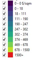
Generally rural land is low and urban land is higher, and it is roughly proportional to the size of the urban area. For some reason all of the Ashburton District looks less valuable than the surrounding areas. Despite the stories you hear about Ashburton, I suspect this might be due to some quirk of how they calculate their rateable values rather than Ashburton being an inherently unattractive district.
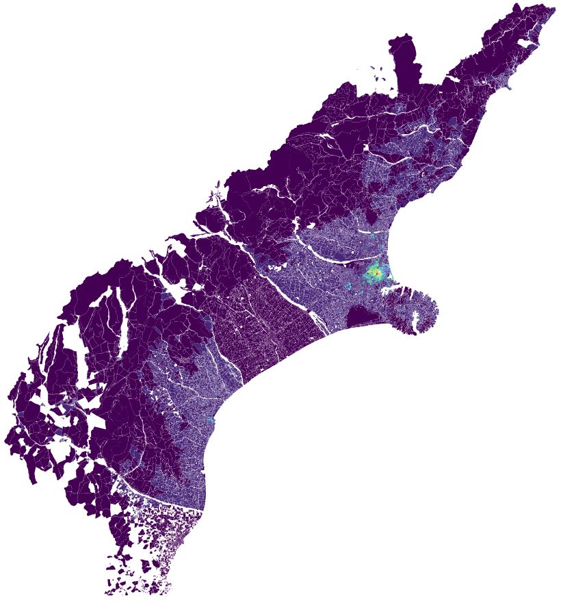
Here is Greater Christchurch.
Again the rural land is low and urban settlements are higher.
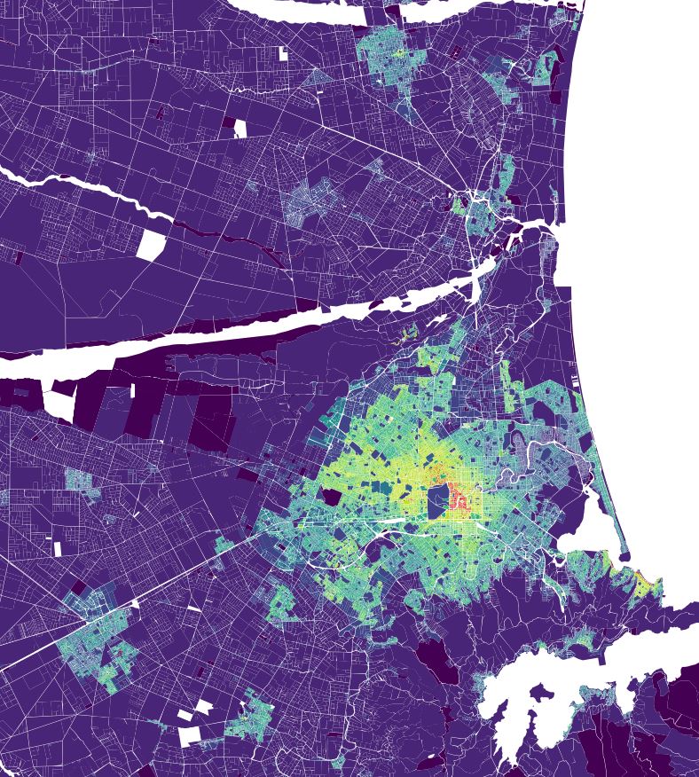
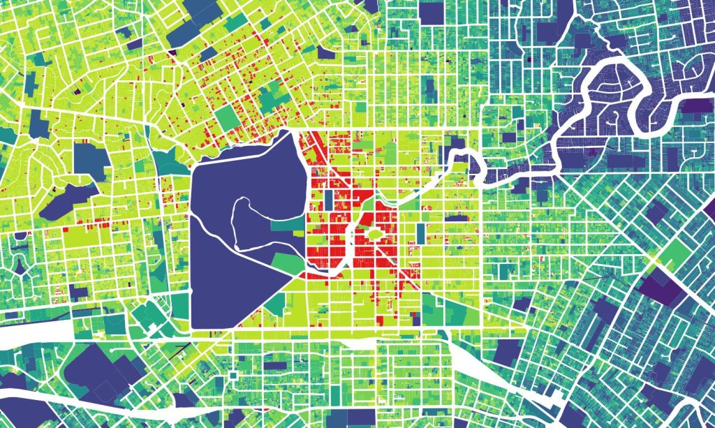
Here is Christchurch City.
Generally it follows the standard trend that almost every other city in the world follows, where the highest value land is in the city centre and it decreases as you head outwards. There are some notable exceptions though:
- Some of the highest value land in the city is along the waterfront of Sumner. This is common in beach suburbs worldwide, although I had thought that climate change may have begun to change that. It is also slightly strange that other beach suburbs don’t have the same level of attraction (e.g. New Brighton).
- I had always thought the hill suburbs were the most expensive houses in Christchurch – Cashmere, Redcliffs etc. I was surprised to see they are not – in fact they are barely any different in value to the flat land below them.
- There is a definite north-westward lean of higher-value areas. The blob of lighter yellow extends from the city centre up into Fendalton, Ilam, Avonhead, almost all the way out to the airport. In contrast land values to the south-east drop off much faster and even just 2-3km out they are already turning bluey-purply.
- The dark purple following the red zone along the Otakaro Avon River is a feature unique to Otautahi Christchurch.
- One thing notable by its absence is the “dough-nut” that people often talk about with Christchurch (I have talked about it myself). I thought there might be a dough-nut of higher value outer suburbs surrounding the lower value inner suburbs, but this doesn’t seem to be the case at all.
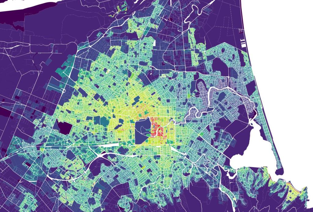
Zooming in to the inner suburbs gives this:
It shows there are some very mixed land values in some the inner suburbs which are going through a transitioning process. Addington and Linwood are both traditionally lower value areas, which are becoming increasingly attractive due to their proximity to the city centre, and are in the process of densifying into more attractive mixed use neighbourhoods for central city workers. In these areas, the map shows the odd spot of red, mixed in with lighter yellow and green, and the occasional spot of darker purple all jumbled together.
And zooming right into the four avenues gives us this.
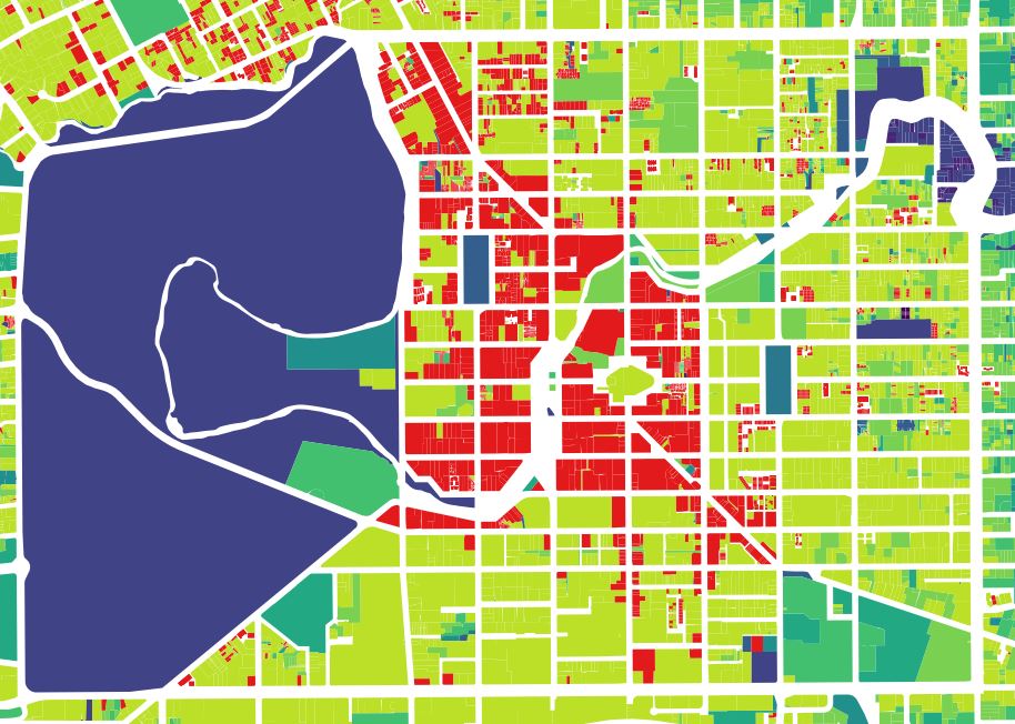
It shows a clear delineation between the inner core and the outer core, almost exactly in line with where the south and east frames run. It’s also closely aligned with the slower 30km/h speed limits – not sure which way the causality runs with that one, I suspect it’s a self-reinforcing loop. The northwestern lean is again very obvious with high value red land all the way up to Bealey Ave and beyond, whereas to the south-east land values are already reducing to bluey-green before you’ve even reached the 4 aves.
I think some of these trends reveal more about human nature than they do about functional aspects of Christchurch city. A lawyer friend of mine who works in dispute resolution said recently that “humans are remarkably efficient at sorting themselves by their socio-economic standing”. As far as I can tell there’s nothing that makes Fendalton inherently more attractive than Linwood in terms of physical topography, views, sun, accessibility, etc. The main attractor appears to simply be that it is full of wealthy people.
I’ve then graphed each section by its value per square metre versus distance from the city centre (which I’ve defined as Cathedral Square). Each dot below represents one section. I’ve also added a trend-line (logirithmic).
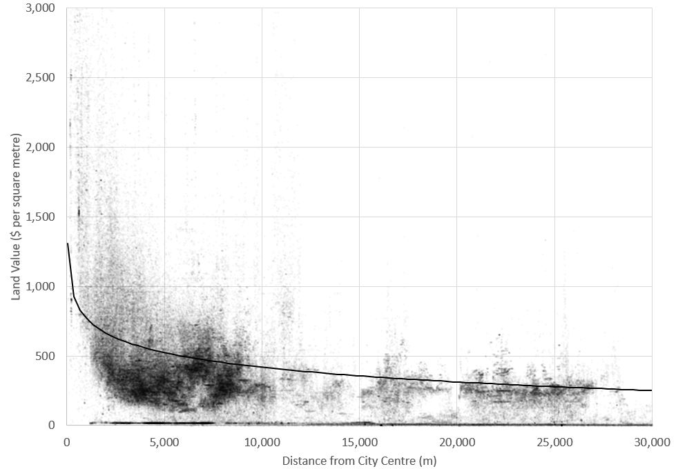
This graph follows the same broad shape as almost every other city in the world, with city centre land being very desirable but dropping off very steeply as soon as you start getting beyond walking distance. Beyond this it drops off much more gradually out to the rural hinterland. It doesn’t show it here, but the slope of this line is much less pronounced than in many cities. Auckland and Wellington for example both have steeper lines than Christchurch and far “peakier” city centre land values.
The graph also highlights how the vast majority of sections in Christchurch are within 10km, with comparatively few between 10 and 20km, and then a wee cluster between 20 and 25km out.
Anything stand out to you about these maps and chart?
