
I’ve written previously about the similarities and differences in the shapes of the various cities in New Zealand here, here and here.
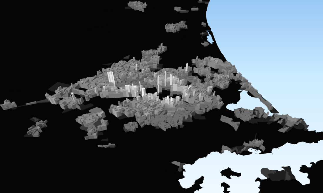
Lately I’ve been playing around with the 3D visualisation tool in QGIS to see what it can do. First I downloaded the population density by meshblock data from the 2013 census. As I’ve said about a hundred times now, this would make make much more sense with the 2018 census data, but unfortunately Stats still aren’t able to provide anything.
I mapped this by colour with white denoting high density residential and black denoting low density residential. Then I extruded the meshblocks up based on density, with the taller blocks denoting higher density and the lower blocks lower density. I did this for the whole country, and have shown a selection of cities below. These are all at the same scale with consistent heights and colourings, so are comparable.
Christchurch:
Wellington:
Auckland: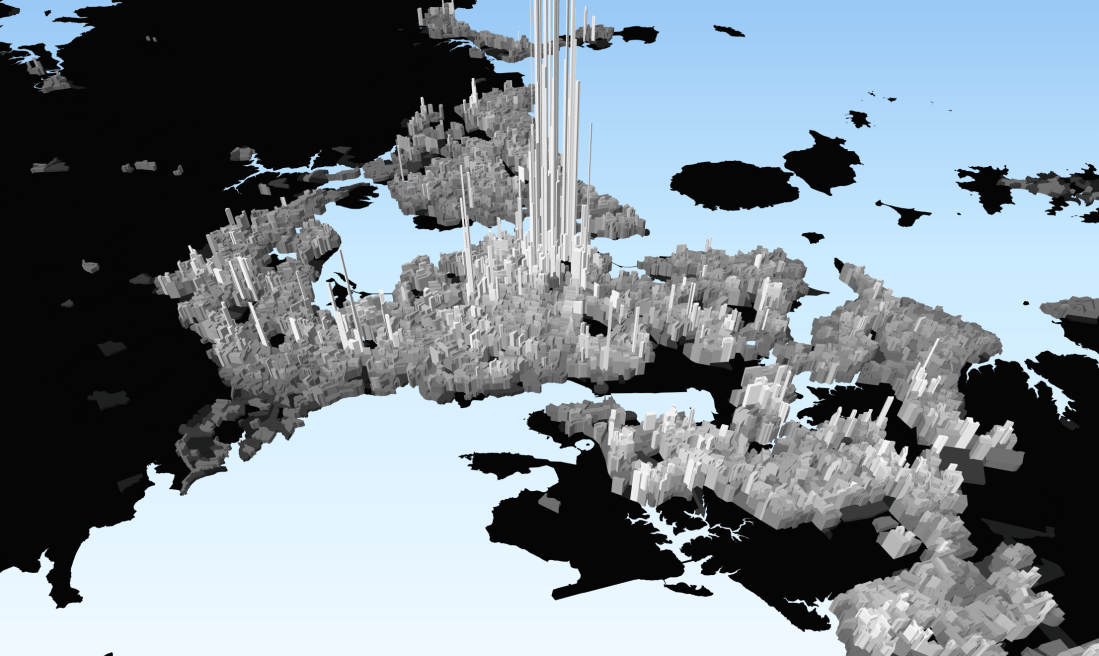
Hamilton:
These show a few things. Firstly, Christchurch does not have the high density core that Auckland and Wellington have. This is of course partly due to the 2013 census being only just after the earthquakes that levelled most of the city centre. But even pre-earthquake (and post rebuild) I suspect it still wouldn’t have intense core that Auckland and Wellington have.
Even in the suburbs, Christchurch has a lower ambient density than Auckland and Wellington. The map for Christchurch is mostly a dull grey, while Auckland and Wellington are a slightly brighter shade. People talk about Auckland’s “leafy” low-density suburbs – Christchurch’s are even lower-density and possibly leafier.
Christchurch is compact. While mountains and sea force Auckland and Wellington outwards in irregular splurts, residents in Christchurch are clustered tightly around the central city, with few people living more than about 10 kilometres away. Wellington and Auckland both have a significant proportion of their populations living 10km+ from the city centre.
Christchurch’s densest areas are the inner suburbs immediately surrounding the central city – Addington, Sydenham, Linwood, St Albans. The Riccarton corridor is dense as well, and there is a big spike at Studentville around the university. There are occasional other localised spikes caused by things like retirement villages. As a general rule, the older suburbs tend to be higher density, while the newer suburbs tend to be lower density.
All up I think the QGIS 3D visualisation tool is quite cool. It doesn’t really provide any new information than what we already know, but it visualises it in a way that can reveal patterns which we may not have noticed before.
Next up – I’ll have a look at employment density. After that I’ll map out some of the options for mass rapid transit and see how they relate to residential and employment densities.
What do you see in these images?

I wish we had floor space per hectare data. Also the lack of 2018 figures is very annoying. Auckland and Christchurch have had significant growth to
2018.
LikeLike
Floor space per hectare would be interesting – I don’t know if that’s available though. I suspect it would probably show a similar pattern to people per hectare anyway. Someone has just sent me 2018 population estimates, albeit at lower resolution than the Census data. Maybe I’ll try again with that sometime.
LikeLiked by 1 person
Tokyo went from 15 sqm per capita in the 1960s to over 30 in the 2010s. This was a significant factor in the nearly tripling of its built environment
LikeLike
Interesting. So densification doesn’t mean smaller homes, in Tokyo it has meant larger homes? That’s probably an important distinction to make to make to old-school quarter-acre, pavlova-paradise kiwis.
LikeLike
Yes. But Japanese housing was very cramped so starting from very low base – hard to compare with the West. Also space per capita may have increased in part due to fewer people per dwelling not bigger dwellers. But that is not the whole story as pop density went up too. So this means a large amount of new dwelling being built in existing parts of Tokyo.
LikeLike