
A couple of weeks ago I posted an article with maps showing results from the 2018 census. These included the two maps below.
The first shows the percentage of people who normally ride the bus to work, organised by where they live.


And this second map shows the same thing but organised by where they work.
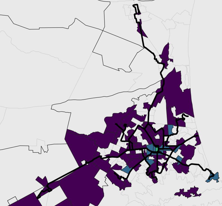
I’ve had feedback that it would also be good to create maps showing the total numbers rather than percentages. So the two maps below show this: the first shows the total number of people living in each zone who normally catch the bus to work.


It shows similar patterns to the mode share map with Riccarton, Addington, Central City and Linwood standing out. A few areas pop out in this one that didn’t show so much in the mode share: Halswell, New Brighton and Addington.
It’s a bit of a worry that the Papanui Road corridor has such low bus use – this is one of the routes being looked at for mass rapid transit, but you wouldn’t guess it looking at this map.
It’s also notable how little the satellite towns currently contribute to public transport use in the city.
The next map shows the total number of people working in each zone who normally catch the bus.
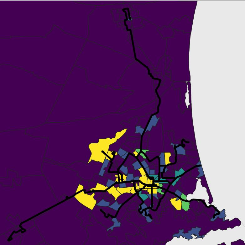
The central city and hospital have by far the most bus commuters as expected. But many of the industrial areas also have quite large numbers (which didn’t really come through in the percentage maps). Places like Birmingham Drive, Sockburn, Hornby, the airport, Sheffield Crescent and Heathcote Valley. The university also comes through strongly.
Most of the malls have high numbers of bus commuters as well: Riccarton, The Palms and Northlands. Eastgate stands out as having low numbers of bus commuters – I’m quite surprised at that.
Workplaces in the satellite towns currently have really low numbers of commuters using the buses.
All up these maps do highlight a few areas that didn’t really stand out in the previous maps. Food for thought…
