I was recently having a look through some of the public transport statistics on the Ministry of Transport website. I found some of them fascinating and help clarify what we’re looking at in Christchurch, so thought I’d share some of the more interesting stats.
A lot of them are based on the household travel surveys and are not particularly new, others are based on public transport data the Ministry collect.
Firstly, how many people have used public transport in different cities around NZ?
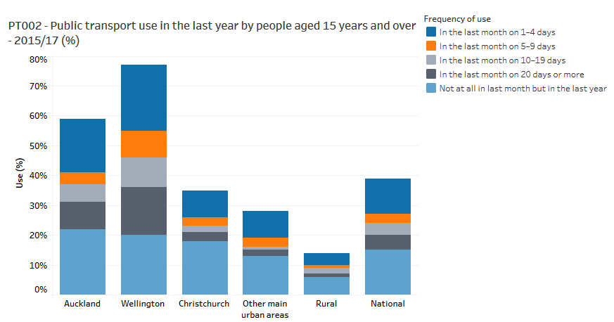
1 in 3 adults in Christchurch have used public transport at least once in the last year. This is higher than I expected, although still a lot lower than Wellington and Auckland. It drops off a lot if you look at regular users – people who used the bus more than 10 times in the last month (the 2 grey bars) only make up 5% of the population, compared to 15% in Auckland and 26% in Wellington.
I think this is useful to remember when telling narratives about public transport use. Public transport opponents often reinforce travel mode “tribalism” by pointing out the fact that regular public transport users make up only a tiny minority of the population. But when you realise a third of the population in Christchurch use public transport from time to time, it completely breaks down that “tribalism” imagery.
Secondly, what do people use public transport for?
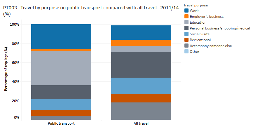
Nationwide, public transport tends to be disproportionality used for trips to and from work (dark blue) and education (light grey), and not used so much for trips relating to personal business/shopping/medical (dark grey), or “accompanying someone else” (mid grey), which presumably is largely ferrying children around.
How does public transport use relate to car ownership?
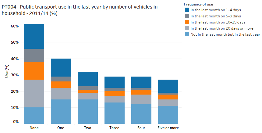
Nationwide, public transport use is inversely related to car ownership.
What cities do we spend our public transport money in?
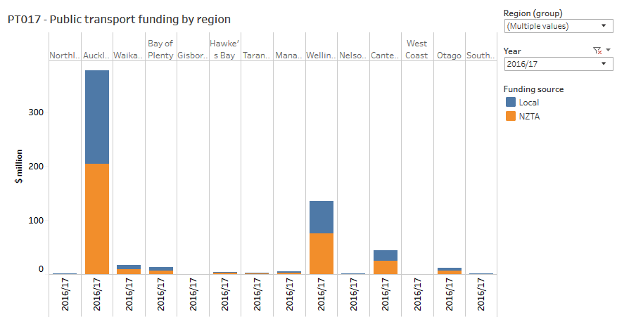
Auckland gets more funding than the entire rest of the country put together. It gets 9 times what Canterbury gets, despite being only 3 times the size. Even Wellington gets triple what Canterbury gets, despite being smaller.
So if we spend far more per capita on public transport in Wellington and Auckland, does that mean we are subsidising them more? The graph below shows farebox recovery rates (the proportion of bus costs that are recovered through fares).
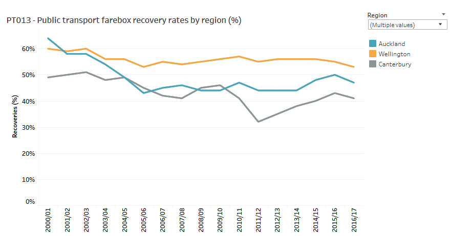
Perhaps unintuitively, the answer is no. The places we spend more money on public transport have higher farebox recover rates, with Wellington leading the way, Auckland following and Christchurch lagging at the back. We should keep this in mind when thinking about investing more money on improving Christchurch’s public transport. If we spend our money wisely it should attract patronage so the subsidy per passenger will be lower than what it is now. {A disclaimer – I’ve only included the large cities in this graph – some of the smaller regions have very high farebox recovery rates – the West Coast leads the country with 75%. But in places like that we are talking about completely different transport systems to our cities, and I don’t think they are comparable}
There’s lots of other good data on the Ministry website so have a look there if you’re interested.
Anything stand out to you?

Good info Chris. I would suggest that Auckland and Wellington have higher farebox recovery rates because much of there public transport is the best choice travel option i.e. due to it being commuter rail or bus rapid transit it is faster than the motor vehicle (or cycling) competition -this effect means the service has high patronage numbers. Add density done well and road and/or car parking pricing like Tokyo then the farebox recovery rate could increase even further.
LikeLike
I think it tells you, quite loudly, that you get what you pay for.
Auckland spends 9 times as much as Canterbury and has over 6 times as much patronage (and that is growing rapidly year-on-year), yet is only approx 3 times the size. Wellington spends 3 times as much, has 2.5 times the patronage, and serves an area approximately the same size. Hmmm.
If Christchurch wants some serious mode shift, which it should, then it has to increase the $$$. Nothing says it louder than these simple stats.
LikeLike